

Responsive design
for a growing business
Background
Sun Rabbit Yoga is one of just three active prenatal yoga studios in Dallas, founded in August 2024 by Michelle—a certified prenatal yoga instructor and former public health worker. Michelle offers a range of classes, including single and couples prenatal yoga, baby & me sessions, private pre- and post-partum lessons, and breathwork techniques. She had built a basic website herself but shared that, without a background in web design or resources to hire help, it didn’t fully reflect her vision. Before this project, I had worked in contraceptive research—focused on preventing pregnancy rather than supporting pregnant people—so collaborating with Michelle introduced me to a new perspective on maternal health and community.
Challenge
Sun Rabbit Yoga’s existing website was difficult to navigate and failed to support the studio’s growing needs. Users often struggled to find and book classes, especially on mobile devices, where the site lacked responsive design. Content and layouts were inconsistent, class information was fragmented across pages, and broken links in the header disrupted trust and usability. The studio’s owner needed a solution that made class booking intuitive, conveyed the studio’s mission with clarity, and established a cohesive, welcoming brand identity.
Impact
The redesigned website streamlined booking into a seamless, mobile-first flow, aligning with analytics that showed most users accessed the site on mobile. Consistent layouts, clear class directories, and responsive design reduced confusion and friction for users, while refreshed branding created a cohesive and professional presence. For the studio, these changes improved usability, built trust with new visitors, and better reflected the owner’s values, helping establish Sun Rabbit Yoga as an accessible and supportive space for prenatal wellness.
DIGGING INTO USER NEEDS
Owner Interview
Michelle, the owner of Sun Rabbit Yoga, provided insight into the studio’s background, growth, and goals for the responsive web redesign. The studio is expanding rapidly, adding new classes, events, and trainings. Over 90% of class sign-ups currently come through Instagram, but Michelle hopes the website can become a stronger channel for private bookings and eventually support recorded classes. She also emphasized the importance of a consistent brand identity that feels calm, confident, and energetic. In addition, she requested a new logo, noting that the current design feels too basic and does not yet capture the spirit of the studio.
Below is a preview of the existing site:
Home
Classes
Training
Blog
Prenatal Yoga
Description
Breathwork
Description
Site Audit
As part of the discovery process, I conducted an audit of the existing Sun Rabbit Yoga website. The following themes emerged -
Missing footer: Many pages ended abruptly, lacking a footer or any closing element. Some ended with a form, others with an image, and several with nothing at all—creating a disjointed experience.
No responsive design: On mobile, the site displayed in desktop format, requiring users to zoom or side-scroll to access content—resulting in a poor mobile experience.
Confusing header: The banner at the top of the site didn’t align with the brand’s visual identity. Layout was compressed, and key links (including “Join Now”) were broken.
Disjointed class listings: Instead of grouping classes by type (e.g., Prenatal Yoga), each was listed individually by date. This made it difficult to view upcoming sessions or understand what was being offered. Filtering options were also missing.
Inconsistent content pathways: Class cards included both “Book Now” and “View More” options—each leading to entirely different pages. “View More” offered class descriptions and booking, while “Book Now” went directly to a date-specific booking screen without context or additional information.
Layout inconsistencies: Spacing, padding, and content alignment varied across pages. Unexpected banners appeared mid-page, disrupting flow and clarity.
Current Landscape
To better understand the prenatal yoga and exercise landscape in Dallas, I completed a SWOT analysis of three direct competitors: Mamacita Yoga, Haven Dallas, and Move Studio. Each offers prenatal yoga classes, but their approaches differ—some build their entire brand around pregnancy care and empowerment, while others emphasize overall health and comfort for the practitioner. I also noticed that all three studios have a limited schedule, often offering prenatal classes only once a week. This creates time constraints for clients and makes the experience feel studio-centered rather than client-centered.
The key gap: While these studios offer prenatal classes, new users face barriers: unclear pricing, missing information, and limited flexibility for those exploring options.
You can view the detailed SWOT analysis here!
Research Interviews
Five participants were interviewed: two current clients (now postpartum) and three non-clients (two pregnant, one postpartum).
In total I asked 11 core questions. Please see the example below.
Existing clients:
What keeps you coming back to Sun Rabbit Yoga?
How did you originally find Sun Rabbit Yoga?
How do you book your sessions?
How often do you attend class? If the class was virtual, or if there were prerecorded videos available, would that increase your likelihood of attending more classes?
Have you ever referred anyone to the studio? Why or why not?
Non-existing clients:
Can you tell me what this website is about? What are your initial thoughts when landing on this site?
Do you feel like you can trust your personal information on this website? What factors do you consider when determining whether to trust a new website upon first introduction?
Based on your navigation of the website, how likely would you be to attend a new class and why?
Based on your navigation of the website, how likely would you be to attend a new class and why? If the class was virtual, or if there were prerecorded videos available, would that increase your likelihood of attending?
I also had the participant completed the following tasks as part of the site audit:
A friend wanted to know about the benefits of prenatal yoga, where on the site would you point them to?
You would like to learn about couples yoga. Please learn more about that class offering and book a class.
“ I want to make sure I can trust both that the instructor is trained to work with prenatal and postpartum bodies, and that the space is safe to bring my child.”
- Landrie
“ These offerings are so unique, I just wish I could find them easier. I would not have found these from the home page.” - Nikki
“ Going to Sun Rabbit Yoga classes postpartum has been wonderful. I feel like I get to connect more to the community and to other mothers in the same stage of life” - Ilana
Affinity Mapping
Key themes emerged:
Trust matters most
Participants wanted to see instructor qualifications, background details, and personal information—especially for prenatal yoga, where trust and safety are critical.Desire for flexibility
All participants—clients and non-clients—expressed interest in remote or recorded classes to better fit unpredictable schedules or distance.
Usability and clarity gaps
This became evident during the audit, as participants struggled to navigate to resources and found the booking content layout confusing. They also noted inconsistent branding and tone.Positive foundations
Current clients appreciated the quality of classes, and new users found the booking process relatively straightforward, suggesting the site had strong starting points.
FROM INSIGHT TO OPPORTUNITY
Business goals and user needs were mapped to identify areas of natural overlap, ensuring that the final solution supported both studio objectives—such as growing private class bookings and expanding virtual offerings—and user priorities like easy navigation, instructor transparency, and flexible access to prenatal yoga. The diagram below highlights these shared priorities and served as a reference point throughout the design process.
These insights led to a clear UX problem statement that framed the design challenge:
Expecting parents struggle to find clear, trustworthy class information online—facing scattered details and limited schedules, which discourages confident booking.
Persona
Meet Cora!
A 34 year-old who is new to Dallas resident, 7 months pregnant, seeking prenatal and couples yoga to build community and confidence during pregnancy.
She is worried about finding a class that fits into her limited free time.
She is unsure what classes are safe and appropriate for each trimester, and want to make sure she is able to choose a safe birthing class.
Prioritize features including:
About page highlighting Michelle’s background, qualifications, and photos of the studio.
Filterable class catalog (private, group, special events).
Homepage class calendar for quick access to upcoming sessions.
Video library for future online classes.
SHAPING THE USER JOURNEY
User Flow
Two key user flows—choosing a class and completing a booking—were mapped to capture the full journey from first site click to final confirmation.
Low Fidelity
Low-fidelity wireframes were sketched to explore structure, tone, and naming.

Home

About

Class Catalog

Class

Booking

Video Library
PROTOTYPING THE VISION
I created mid‑fidelity prototypes for desktop, tablet, and mobile to test the overall structure, layout, and key interactions across the site. While all formats were considered, I chose to present the mobile layouts in the case study, as analytics from the existing site indicated that mobile was the primary way users accessed content. I focused first on designing the Home, About, Class Directory, individual Class Page, Virtual Yoga, Blog, and Resource pages. These pages were chosen to test two core user flows: ensuring users could quickly navigate and book a class without friction—a key business goal from the owner—and helping users learn about the studio’s background and mission to build trust and comfort before booking, which emerged from user interview feedback. By prototyping these pages early, I could evaluate both usability and the clarity of information that supports user trust and engagement.


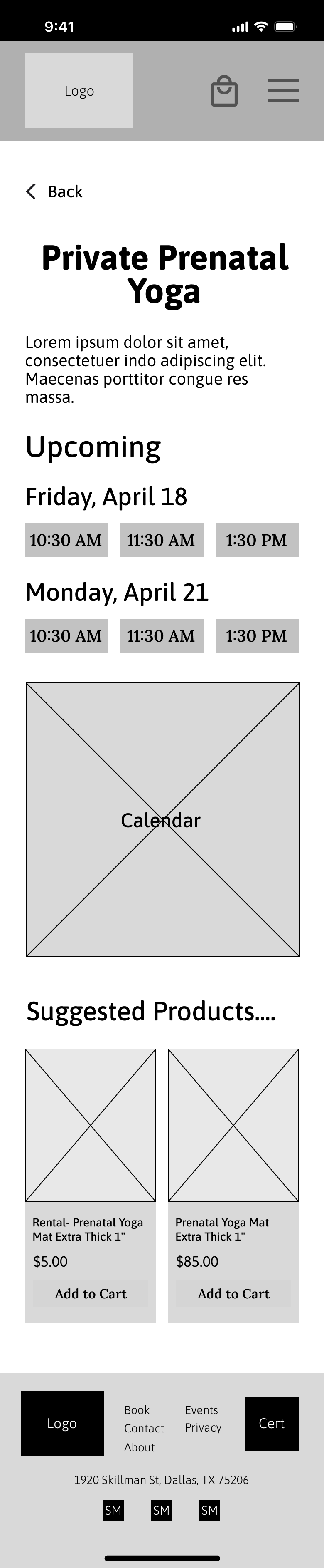


Mid-Fi Testing
User testing was conducted on the mobile prototype by asking 5 participants to navigate to and sign up for the Private Prenatal Yoga class scheduled for April 18th at 11:30 a.m. All users successfully completed the task without major barriers. However, a few consistent points of feedback emerged:
Touch points felt too small to tap easily
The layout appeared crowded, making text feel cluttered
I also reached out to Michelle, the owner, to receive her feedback. Her feedback was positive, but she had two requirements: Booking shouldn’t require creating an account and classes should be sortable by pregnancy vs. “mommy & me” (postpartum).
Based on this feedback, the following updates were made moving into high fidelity:
Enlarged touchpoint sizes to improve mobile usability.
Reduced on-screen text and reorganized layouts for better clarity.
Added a filter to the class catalog, allowing users to sort by pregnancy or “mommy & me” classes.
DESIGN THAT CONNECTS
The owner was open to a complete rebrand, including a new logo. I worked closely with her throughout the process to ensure the final design fully captured the calm, confident energy she wanted the studio to convey. While I had significant creative freedom, she shared a few guiding parameters:
The color palette shouldn’t feel overtly feminine
The logo should include traditional yoga symbolism, like a yin–yang element, without becoming too generic
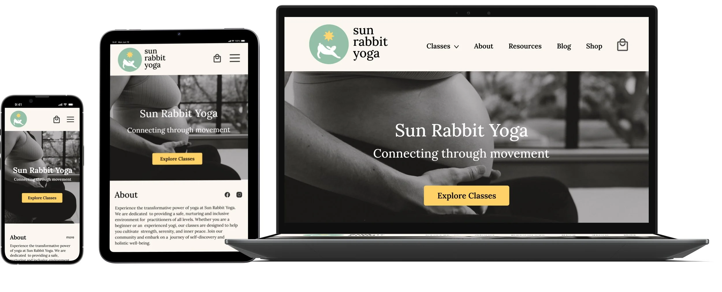
Inspired by Michelle’s story, her studio’s focus on calm, confident energy, as well as client feedback, I created a color scheme combining gentle earth tones with warm, energetic accents. The primary sage green is complemented by yellow and pink highlights for calls to action. For typography, I chose Lora, a soft serif that feels professional yet inviting.
Designing the logo was a more iterative process. It needed to incorporate a rabbit as the focal point, the sun, and visual ties to yoga. I explored multiple variations, emphasizing different aspects of these symbols. Through quick feedback rounds—asking people what they thought the logo represented—I refined the design until it felt balanced, distinctive, and clear. The final logo combines Sun Rabbit Yoga’s key symbols: an eight-point sun and a rabbit posed in a gentle stretch, its slightly rounded shape subtly referencing both fertility and calm.
Old Version
First Iteration
Final Iteration
FINAL SCREENS & FEEDBACK
After applying the refreshed branding, color palette, and typography, I built a high‑fidelity prototype to bring the design to life visually. This allowed me to test the full experience as users would see it, evaluate the effectiveness of the visual hierarchy, and ensure that brand personality and usability worked together across desktop, tablet, and mobile layouts. Please see the mobile layout below.


Hi-Fi Testing
A second round of usability testing was conducted with five users, asking them to complete three task flows on mobile and desktop (please see the linked Figma file here). Success was measured by task completion time and number of clicks, based on clearly defined user paths for each flow.
Task flow and metrics:
Task 1 (mobile):
Sign up for the Private Prenatal Yoga class
Target: 4 minutes | 3 clicks
Task 2 (mobile):
Find the four major benefits of prenatal yoga
Target: 3 minutes | 6 clicks
Task 3 (desktop):
Find two ways to sign up for the Private Prenatal Yoga class (via homepage calendar and class catalog)
Target: 3 minutes and 3 clicks through the calendar, 5 minutes and 6 clicks through the class catalog
All participants completed the task within the time limit; however, they exceeded the target number of clicks when navigating to the page listing the major benefits of yoga. While overall feedback was positive, users highlighted a few areas of confusion:
The page explaining prenatal yoga and breathwork was unclear; users expected it under “About,” not “Resources.” The About page title was unclear; several users assumed it was about prenatal yoga itself rather than the studio owner
The homepage calendar wasn’t obviously interactive; users didn’t realize it linked to classes.
Based on this feedback, updates were made in the form of:
The “About” section was split into two subsections: The Studio (about Sun Rabbit Yoga) and The Practice (about prenatal yoga and breathwork).
Before
After
Added color-coded indicators on the desktop and tablet calendar to signal clickable days with upcoming classes.
Before
After
A final round of usability testing with five new users, focusing on two updated task flows: locating the four major benefits of prenatal yoga, and finding two ways to sign up for the Private Prenatal Yoga class. These flows were selected to evaluate whether recent design updates resolved earlier friction—specifically around interacting with the calendar and accessing studio information. All participants completed the tasks successfully, staying within the expected time and click limits.
The final designs were then reviewed with Michelle, who responded with positive feedback and no additional revisions. She received a full copy of the files, and I’ll be continuing to support the project as the developer. Stay tuned for the launch of the updated site!
DESIGNING, LEARNING, IMPROVING
Creative freedom = asking intentional questions
Michelle was wonderful to work with and gave me significant creative freedom. That sounded wonderful at first, but I quickly realized that full creative freedom is significantly harder than working with some amount of parameters. This taught me that real clarity comes from asking thoughtful questions to uncover hidden expectations and visions.
Iteration leads to solution
I struggled at first to design a logo that balanced everything Sun Rabbit Yoga represents: it had to feel like a yoga studio, while also incorporating both a rabbit and an eight-point sun. It felt like too many elements pulling in different directions. So, I started sketching, digitizing, and gathering feedback. When my first draft was mistaken for a rabbit rescue logo, I went back to the drawing board—again and again. Through this process, I realized that meaningful design often takes time, and each round of iteration brings the concept closer to what it truly needs to be. In the end, the final logo captured exactly what I hoped for—and what Michelle envisioned.