
Duolingo
Designing seamless writing experiences for non-Latin language learners
Background
Duolingo is one of the most popular language-learning platforms today, offering over 40 languages and reaching a global audience—80% of its users are outside the US. With ~116.7 million monthly active users and $531 million in revenue (2023), Duolingo appeals to a broad demographic, skewing slightly younger (18–34) but serving learners of all ages, whether for K–12 education or professional development. Its gamified approach makes learning feel motivating, fun, and accessible.
As someone with a 2,000-day Duolingo streak, I’ve experienced both its strengths and gaps firsthand. When I set out to learn Arabic, I quickly realized that while the app helped me memorize characters, it lacked meaningful ways to practice handwriting. This missing hands-on interaction dampened my motivation, leading me to switch to a Latin-based language that felt easier to reinforce offline. Although Duolingo later introduced limited writing practice, it remains separate from the main lesson flow. For this project, I set out to design a more seamless and engaging solution—embedding handwriting practice directly into the core lesson experience to help learners feel supported, confident, and connected to the language they’re studying.
Challenge
Duolingo’s lessons build recognition and pronunciation skills effectively, but they fall short when it comes to handwriting in non-Latin languages. Without in-app writing support, learners are forced to turn to external tools like YouTube or tracing books—creating a fragmented learning experience that limits confidence and fluency in writing independently. The challenge was to close this gap by designing a seamless way for learners to develop handwriting skills within the Duolingo ecosystem.
Impact
The redesigned lesson flow integrated tracing exercises, stroke order guidance, audio support, and real-time feedback directly into the app. This addition allowed learners to practice writing alongside vocabulary and pronunciation, creating a more complete, immersive path to fluency. By making handwriting practice an intuitive part of the lesson experience, the design boosted learner confidence, reduced reliance on external resources, and highlighted new opportunities for Duolingo to expand its value for literacy-driven learners.
OBSERVING, LISTENING, LEARNING
Current Landscape
To better understand how other language‑learning platforms approach handwriting, I conducted a SWOT analysis of three direct competitors: Babbel, Mango Languages, and Rosetta Stone. Through this analysis, I was struck by how advanced and varied their speaking and reading tools were—each offered creative ways to engage users in verbal practice. Yet despite this strength, none provided integrated handwriting instruction for non‑Latin scripts, highlighting a significant gap in supporting learners who want to write as well as speak and read.
The key gap: While these platforms support speaking and reading, they don’t help users actively practice handwriting—leaving learners to rely on memorizing characters instead of truly learning to write them.
Research Interviews
I began by identifying interview participants who were either fluent in a non-Latin language or currently learning one. In total, I conducted five interviews: two with active Duolingo users, two with multilingual speakers from birth, and one with someone who became fluent through formal study.
A total of 14 questions were asked. A sample of these questions being:
How do you maintain your knowledge of a language?
When learning a language, what techniques do you find the most impactful?
Please rate your confidence in a few components of language (reading, speaking, and writing) on a scale of 1 to 10.
“ I am a hands on learner, so I carry a notebook to practice writing after taking my Duolingo lesson.”
- Kelsey
“ I grew up speaking Thai, but I always struggled to write it because of the small tonal details.”
- Natt
“ When taking Russian courses in college, I took my notes in Russian, which really helped with immersion”
- Elisabeth
You can view the detailed SWOT analysis here!
Affinity Mapping
When learning a language what techniques helped you learn to write with confidence?
When learning a language where do you feel that you struggle when writing in the language?
Key themes emerged:
Even advanced learners lacked confidence in writing by hand.
Fluent or semi-fluent writers improved through hands-on practice and repetition
Participants who attempted to learn how to write on their own, but had no real-time feedback were unable to know if they were writing correctly.
Only the participant who studied formally rated their writing ability with confidence, offering insight into effective handwriting practice.

To better understand the core challenge, I analyzed findings from my research, interviews, and competitor analysis, which revealed the following key insights:
UNCOVERING THE CORE CHALLENGE
Learners feel confident recognizing and typing characters, but not writing by hand.
Recognition alone doesn’t translate into handwriting fluency, leaving learners unsure if they’re doing it correctly.Lack of integrated writing practice disrupts learning flow.
Users often rely on external tools (YouTube, tracing books), which interrupts momentum and feels disjointed from the main lesson structure.Feedback and a sense of progress instill confidence
Without guided practice and real-time correction, learners can’t see their progress, leading to hesitation and lower motivation.
Motivation is personal—but unsupported.
Each language learner had an emotional reasons (family, history, travel) driving them to learn or sustain a language, but Duolingo doesn’t fully support these meaningful goals.Competitors also neglect balanced skill-building.
Other language apps focus heavily on reading and speaking, while handwriting remains an afterthought or is completely absent.
These insights led to a clear UX problem statement that framed the design challenge:
Duolingo users lack integrated handwriting practice for non-Latin scripts, forcing them to rely on external tools—weakening confidence in real writing and increasing the risk of disengagement from the platform.
Persona
Meet Mina!
27-year-old Korean adoptee who wants to handwrite a letter to her birth mother in Korean.
Learning online, but has no way of verifying if her writing is legible or correct.
On a limited budget, and cannot afford formal Korean language lessons, nor is there any local Korean population in her area.
Based on the user research, and gaps in the current products, prioritized features included:
Updated touch interface that allows users to trace. The interface would need to register stroke location within the touchbox to determine if the character had been written correctly.
Outlines of characters that would allow users to trace within dotted/dashed areas during lessons.
Audio pronunciation alongside writing practice tracing (although this is unable to be presented in the prototype due to technical limitations)
The process began by mapping out a user flow that shows where handwriting practice could naturally fit within existing lessons.
BUILDING THE EXPERIENCE
User Flow
Low Fidelity
Low‑fidelity wireframes began by being sketched on paper. The goal at this stage was to map out ideas and identify how handwriting could feel integrated rather than isolated. Once these concepts were outlined, I moved into digital wireframes to refine layout and structure.

Writing - Letters

Writing - Phrases
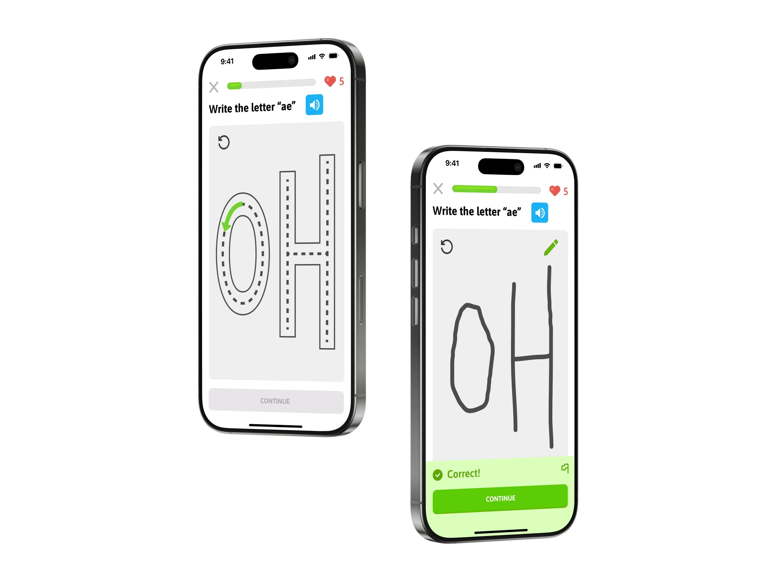
FROM SKETCHES TO SCREENS
Mid‑fidelity prototypes focused on refining visual details, spacing, and the way users could view and correct mistakes. Throughout the process, the goal was to balance guidance with exploration—supporting users without adding unnecessary friction. The task flow shown below guides users through learning to write the Korean letter ae: first by tracing each stroke, then by writing it from memory.


Mid-Fi
Conducted by asking 5 participants to finish 1 task:
Complete the lesson above
Results and Improvements
All users successfully completed the task without major barriers. However, a few consistent points of feedback emerged:
Instructions for open-ended writing tasks needed to be clearer.
Learners wanted more repetition and guided tracing before attempting to write characters from memory.
Some buttons, like “Practice Again,” were overlooked or misunderstood.
When writing from memory instructions and a pen indicator to guide the user
After
Before
Added additional tracing practice in which users trace the characters without the guide arrows before writing from memory.
Original “Continue” screen separated into two parts: one screen offering users the choice to keep practicing or continue, and a second screen that indicates the next practice activity.
Before
After
After
COHESIVE BRANDING
Although the majority of Duolingo’s existing branding was used, I adapted and expanded it to fit the new handwriting feature.
To allow for better flow between stages of the practice I added prompting cards, utilizing existing Duolingo graphics.
To show the characters in context, I created Duolingo-esque cartoons.
A SEAMLESS INTEGRATION
High-fidelity prototype included new elements. Along with the addition of a tracing exercise, I added an additional character for the user to practice, expanding this practice into a comprehensive lesson. Duolingo’s branding was integrated into the design, smoothing transitions between practice steps.
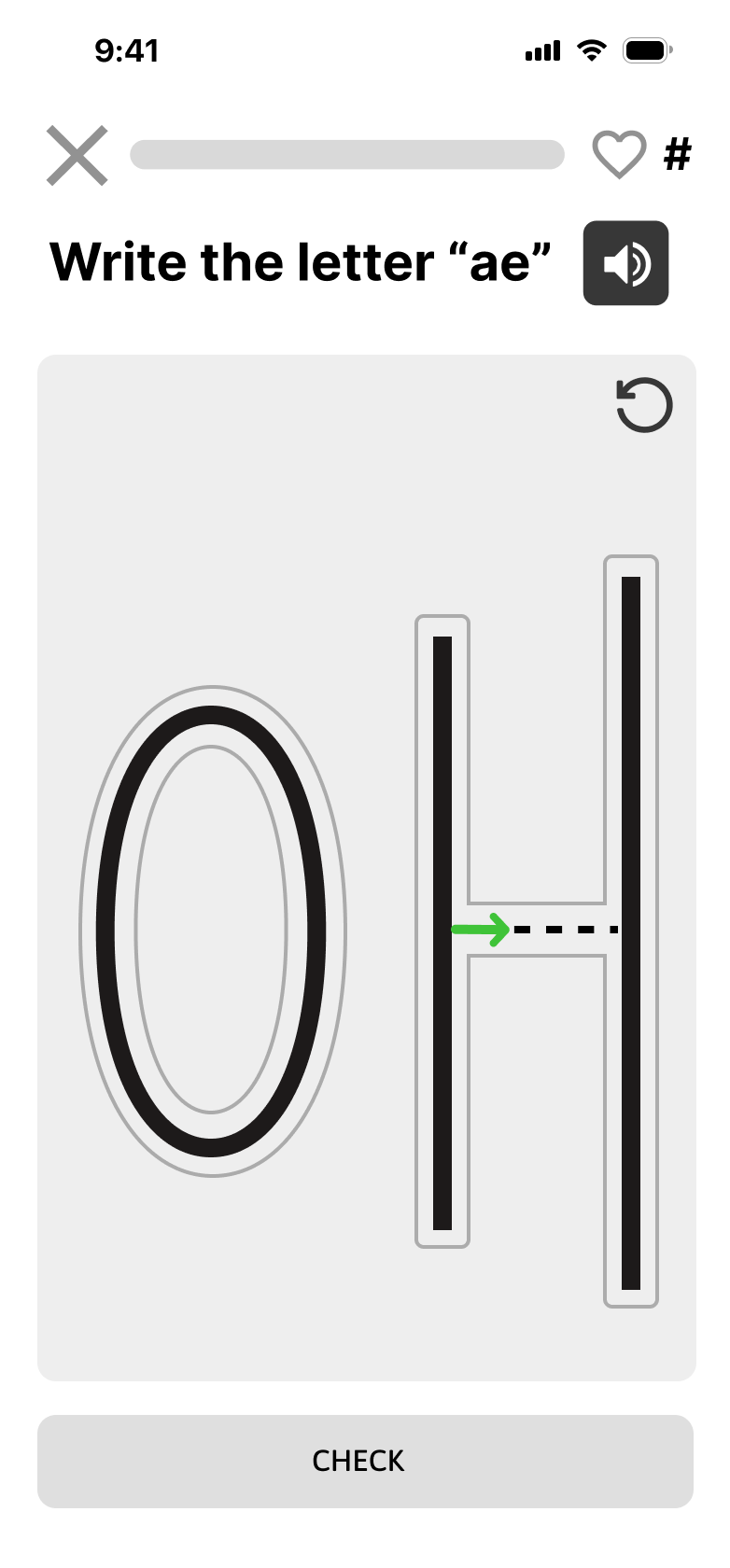
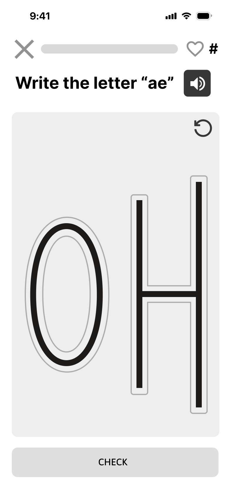
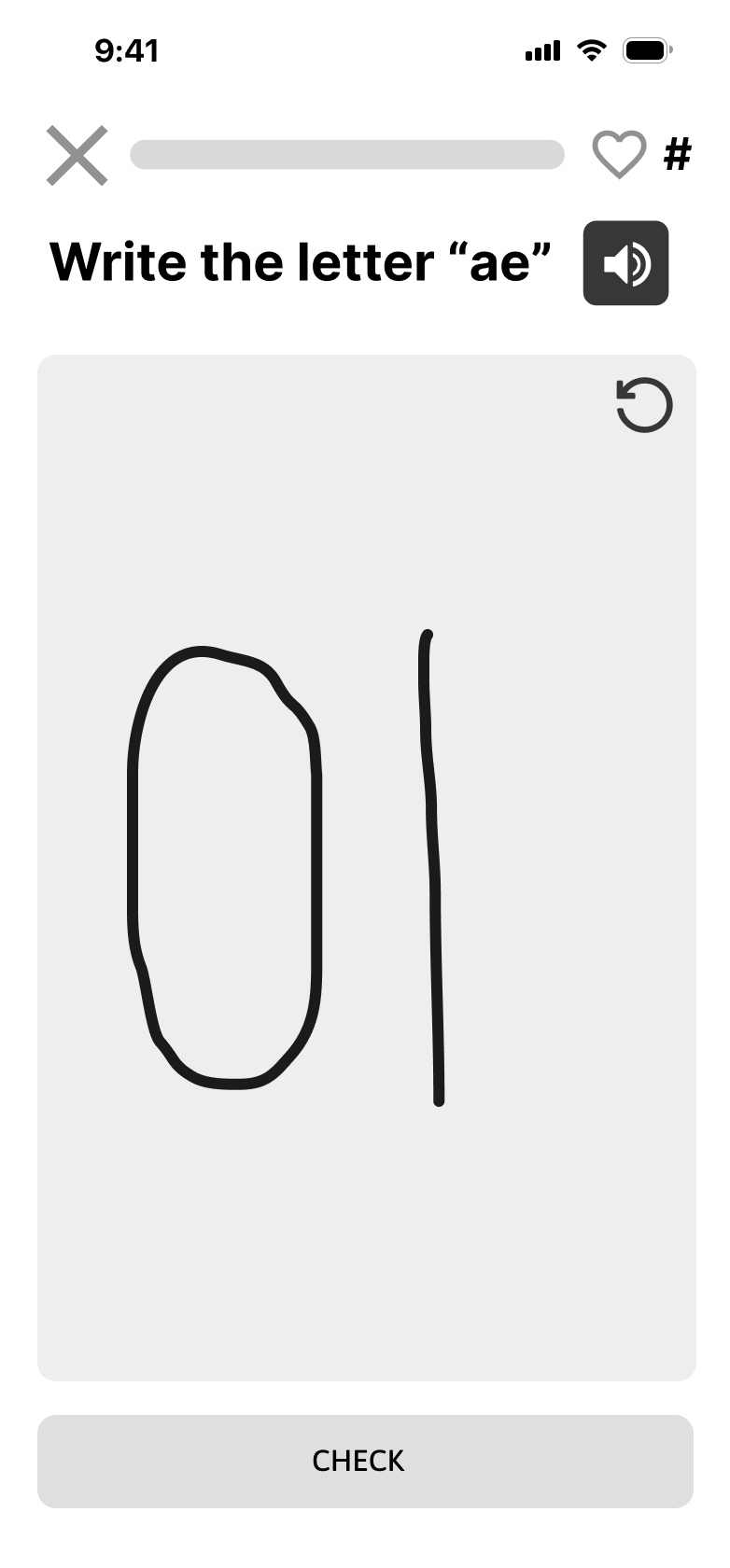
Tracing with stroke direction indicators


Tracing without stroke direction indicators


Writing from memory


Second letter “gye” follows same sequence
Hi-Fi Testing
I conducted a second round of usability testing with five users, asking them to complete a task flows. The test flow and metrics was:
Navigate from the Duolingo homepage to the “Learn Korean” lesson and return back to the homepage
Target: Under 6 minutes
Results and Improvements
Users raised questions and encountered minor points of friction, resulting in the following key insights:
Users indicated that learning two words is manageable and not too overwhelming.
Providing an example of the word in context would help users understand its usage among other characters.
Requiring users to click on the pen to start writing from memory slows down the process and is not immediately intuitive. It was suggested that writing should be triggered by clicking into the open writing box.
Lesson titles and section names updated showing the lesson is specifically a writing lesson.
Text stating that the order of the strokes is important.
Clearer and more supportive error messaging.
Before
After
Removed the need to touch the pen when writing. It now auto select the pen when a user touches the writing box.
Before
After

After writing the letter from memory, users see a context screen showing the character in use, complete with phonetics, visuals, and audio.
LESSONS FROM THE PROCESS
In EdTech, user feedback guides the way
Determining how much repetition learners needed for each character wasn’t obvious at first. Research from learning science offered a starting point, but observing users directly proved invaluable. Watching how users interacted with tracing, and noting both their verbal comments and nonverbal cues, helped pinpoint the right balance between guidance and challenge. This user-centered approach ensured the final design felt supportive rather than repetitive.
Self-editing keeps design aligned with the goal
At times during the process, I added extra exercises—like additional characters to trace or matching tasks. After fully designing these features, I realized they didn’t fit the original goal and conflicted with user feedback, costing time and effort. This experience taught me that while exploring beyond the initial scope can spark ideas, it’s essential to pause and reflect before investing deeply in features that may not truly serve users.