


Capturing curiosity at its first spark
Background
In today’s digital landscape, access to free or affordable education has never been greater. Over the last 13 years, Massive Open Online Courses (MOOCs) have grown rapidly and reached learners worldwide. Apps that create immediate personal investment can help bridge this gap, especially when combined with the novelty effect: the motivational boost people experience when trying something new. While this boost often fades over weeks or months, it can be sustained through ongoing reinforcement, like personalized class suggestions informed by AI conversation and learning history.
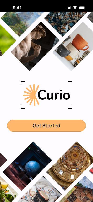
The idea for Curio began with my own camera roll. Beyond photos of my cat, it’s filled with snapshots of architecture, stained glass, museum exhibits, and paintings—moments that sparked curiosity and the thought “I’ll look this up later.” But life gets busy, and those sparks fade into forgotten screenshots. Curio was created to capture that moment of inspiration and turn it into action before the excitement is lost.
Challenge
Online learners often struggle to find courses that feel relevant and inspiring. Most platforms rely on rigid filters and endless lists, leaving people overwhelmed and unsure where to start. Curio set out to change that by reimagining course discovery as a creative, intuitive experience.
Impact
The final design showed that discovery could feel more like a conversation than a search. By letting users upload an image and refine results through natural dialogue, Curio made exploration personal and engaging. Learners reported higher confidence in their choices and greater enjoyment in the process, proving that a playful, user-centered approach could transform how people connect with learning opportunities.
SEEING BEYOND ASSUMPTIONS
Validity Survey
I began by conducting a validity survey to understand whether others also experienced a drop-off between feeling inspired and actually following through. I also wanted to capture what that initial spark of inspiration felt like. To explore these areas, the survey asked participants questions such as:
What typically prevents you from turning interest into action? Select all that apply.
·
On a scale from 1 to 10, how often do you feel excited to pursue a new hobby, subject, or skill but end up not following through?
·
When you feel this spark of inspiration, which of the following best describes how you proceed learning about a new interest?
·
What emotions do you associate with starting something new, like a course or a project? Check all that apply.
·
Eleven individuals responded to the survey.


From these responses, a few initial insights emerged:
Inspiration is frequent, but actual follow‑through tends to be low.
The moment of interest often comes with a mix of overlapping emotions.
Motivation is highly personal, yet the ways people capture or act on that motivation can vary widely.
Current Landscape
To better understand the landscape of tools that help learners explore and act on new interests, I conducted a SWOT analysis of five platforms: Class Central, Skillshare, and MasterClass (direct competitors), alongside Reddit and ChatGPT (indirect competitors). The direct competitors all focus on helping users find and enroll in structured courses, while the indirect competitors support curiosity and exploration through discussion or AI-driven discovery. Analyzing their strengths, weaknesses, opportunities, and threats helped identify where Curio could stand out—especially in capturing spontaneous sparks of interest and guiding users seamlessly toward meaningful learning experiences.
The key gap: Most platforms work well once users know what they’re looking for—but few help capture spontaneous curiosity and transform it into a structured, personalized learning path.
You can view the detailed SWOT analysis here!
Research Interviews
I aimed to find a wide range of participants for research interviews, including people who successfully and unsuccessfully pursued new interests.
In total, I conducted 5 interviews. In these interviews I asked 9 questions. Please see an excerpt of these questions below.
General:
Can you describe what inspiration feels like to you? What last inspired you to learn more? Why did you want to learn about this?
When you are inspired what is your immediate next step? When pursing a new interest, how do you determine where to start?
Have you had instances where you have not followed through with an interest? What did that feel like? What kind of information or steps are you missing in that moment?
When you are pursuing a new interest, do you track your progress? Do you use any specific tools to stay consistent?
App Specific:
If you took a picture of something that inspired you, what kind of learning opportunities would you hope the app would suggest?
Beyond the initial step of finding resources from a photo, what other features or types of support would help encourage you to actually use the app consistently?
What role, if any, do tangible results play in maintaining your motivation to learn a new skill?
"I get inspired very easily. Follow through is a different story." - Abbey
"I think honestly, if you have some sort of... goal, it makes me more motivated." – Noelle
"I really don't think I would have been able to do it without, like, accountability." – Ruby
Affinity Mapping
Key themes emerged:
Inspiration usually begins with a spontaneous spark, often saved via photos, notes, or tabs—but this rarely leads to action.
Barriers are time constraints, waning interest, and cost.
Motivation increases when users track progress, set goals, and break down tasks.
Users wanted progress tracking, multimedia uploads, and a supportive experience
TRANSLATING RESEARCH INTO DIRECTION
To better understand the core challenge, I analyzed findings from my research, interviews, and competitor analysis, which revealed the following key insights:
Inspiration is common but fragile
Many users experience sparks of curiosity but quickly lose momentum if not supported right away.Mental load dims motivation
The effort of searching, evaluating resources, and deciding next steps alone feels overwhelming, which discourages follow-through.Guidance makes a difference
Those who had structure or suggestions in the past were more likely to keep exploring an interest.
Motivation is personal and emotional
Users described excitement, hope, and creative energy in the moment—but also doubt, impatience, and anxiety.Existing tools are fragmented
Users rely on screenshots, notes, and open tabs, but these are scattered and rarely turn into sustained learning.
These insights led to a clear UX problem statement that framed the design challenge:
Learners often feel an initial spark of inspiration, but without tools to capture and guide that moment into action, interest quickly fades—leaving them discouraged and turning elsewhere instead of engaging deeply with new learning opportunities.
Persona
Meet Ranya!
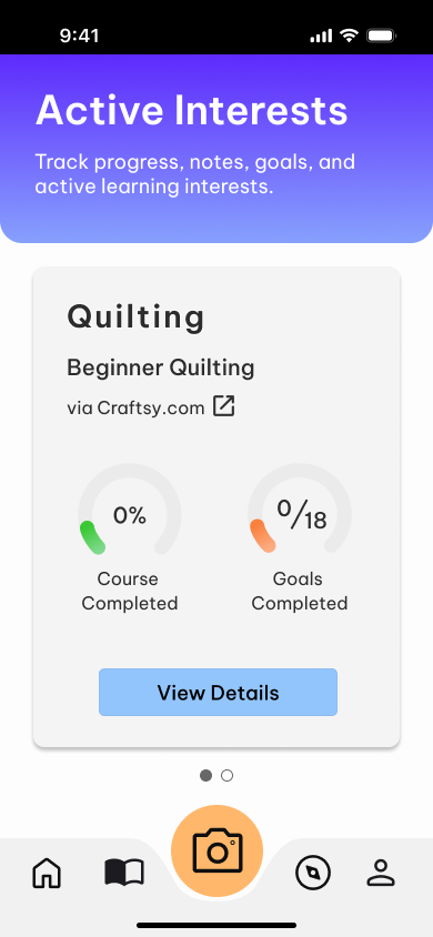
A 28-year-old inspired to take up quilting while visiting an indigenous textile exhibit during a museum visit.
After her initial excitement, Ranya struggles with having no immediate, guided way to capture and act on her interest.
She faces the mental burden of researching, evaluating resources, and deciding what to do next, all by herself.
User Journey
By mapping Ranya’s journey, I identified the points where her motivation fades, revealing why support and structure are essential to help her move from curiosity to engagement.
Based on the user research, and the gaps in current products, prioritized features included:
Custom RAG (Retrieval - Augmented Generation) AI, suggesting only verified classes
AI chatbot acts as a friendly guidance counselor, asking smart questions
Built‑in camera captures inspiration instantly, sparking an AI-guided chat
STRUCTURE BEFORE STYLE
Site Map
This site map to organized initial ideas for the app’s main sections and navigation structure — ensuring users could move easily from capturing a new interest to exploring suggestions, tracking progress, and managing their profile.
User Flows
Low Fidelity
Low-fidelity wireframes were sketched on paper to explore structures, naming, and interaction patterns for capturing inspiration and translating it into browsing and tracking courses. These ideas were then developed into digital wireframes to refine layout, hierarchy, and overall tone.

Homepage
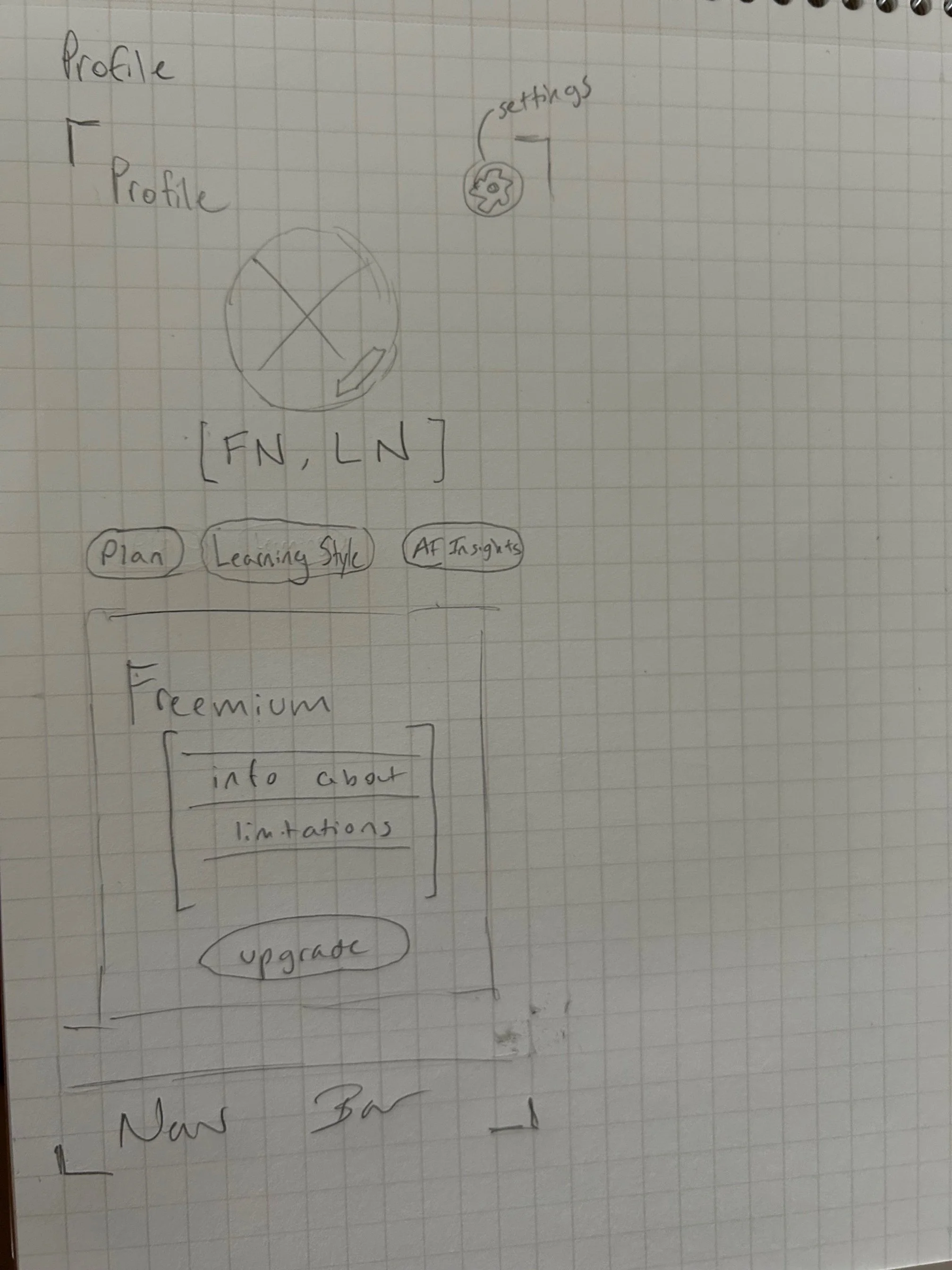
Profile

Capture Image

Chatbot

Active Inspiration
DESIGNING, TESTING, IMPROVING
Mid‑fidelity prototypes focused on refining layout, hierarchy, and how users navigate from capturing inspiration to exploring and tracking classes. Throughout the process, the goal was to help users act quickly on new interests without feeling overwhelmed. The task flows built at this stage included signing up, finding a class and adding it to Active Interests, and accessing an existing class to open its course link — all supported by screens like the home page, chatbot conversation, and explore page.


Mid-Fi Testing
Conducted by asking 5 participants to complete two tasks:
Sign up for Curio, find a class, and add it your active interests
Access an existing class and open the course link
Results and Improvements
All users successfully completed the task without major barriers. However, a few consistent points of feedback emerged:
The homepage contained too many actions, most of which do not indicate their interactive purpose, leading to confusion.
The camera was not immediately intuitive, as most felt that it was either a placeholder for a picture, or completely obtrusive to the homepage, causing a fractured flow.
Having the AI chatbot as the focal button was confusing. The button was not recognizable to users, and it felt repetitive, as users would be interacting mainly by taking a picture and starting a chat. Testers were unsure how they would access previous conversations without a frustrating amount of clicks.
Simplified homepage
Simplified Active Interest page
After
Before
After
Before
Rework navigation
After
Before
*Because users must capture an image before interacting with the chatbot, there was no need for the chat icon to be visible in the navigation bar.
Add tutorial overlay for clarity
CRAFTING A VISUAL IDENTITY
Curio reflects the pride in pursuing new interests and the idea of building a personal cabinet of curiosities. The logo combines a yellow spark (capturing inspiration) with a subtle focus frame (camera capture).
Sketches
Final Logo
While my initial design used muted colors with pops of yellow to represent the spark, I realized the palette needed to better reflect the vibrancy of curiosity itself. It evolved into a bold mix: a vibrant purple paired with a grounding blue, and a warm yellow‑orange accent highlighting key CTAs and features. To complement this, I chose the Be Vietnam Pro typeface — a slightly rounded, humanist design that feels modern, friendly, and highly legible, striking a balance between clarity and personality.
BRINGING IT ALL TOGETHER
Focus now shifted to consolidation and simplification of the layout, redefining the focal point of this app, and utilizing visual hierarchy to emphasize key interaction points. The AI chat button was removed, and the camera became the focal point. The home page was trimmed, focuses on just current external classes, and internal interest pages.


Hi-Fi Testing
I conducted a second round of usability testing with five users, asking them to complete four task flows. The test flows and metrics included:
Task 1:
Sign up for Curio and navigate to the home page
Target: Under 2 minutes
Task 2:
Find a suggested class and save it for later
Target: 4 minutes
Task 3:
Capture a new interest and use it to add a class
Target: 4 minutes
Task 4:
Add a notebook entry related to Quilting
Target: 3 minutes
Results and Improvements
Users highlighted a few areas of confusion:
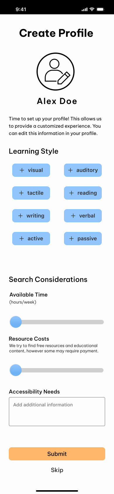
The “Search Considerations” section on the Create Profile page was unclear; users weren’t sure what information they were being asked to provide.
Users requested more consistent UI elements, particularly in the Active Course card design and the use of icons within the Discover tab.
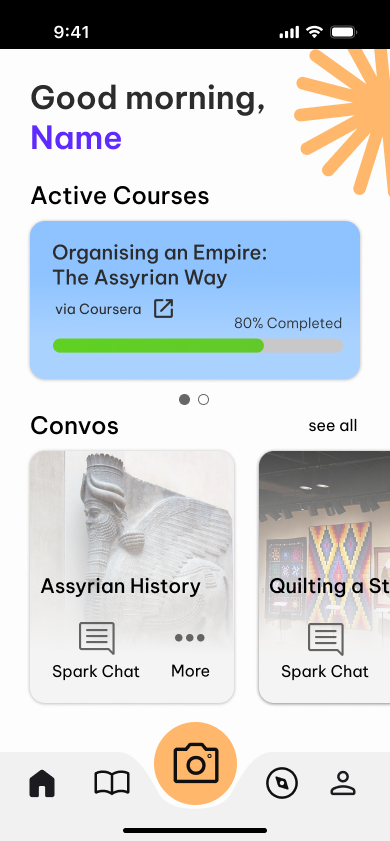
The “Convo” header label was unclear; users weren’t sure what content or functionality it referred to.
Users were confused by the lack of a visible save button in the notebook, making it unclear how or when notes would be saved.
Updated “Create Profile” page, clarifying the option to select multiple learning styles, and ability specifying time and cost ranges.
Before
After
Increased chat font size from 14px to 16px for accessibility.
Before
After
Renamed the Explore page to Discover, as 4 out of 5 users refer to it as such during the test. Added icons, and extended the icons onto subsequent pages for continuity
After
Before
Addition of an autosave icon at the bottom right corner of the notebook text boxes. Developer note added to specify autosave will trigger after 15 seconds of inactivity.
Before
After
UI continuity improved through a subtle gradient added to the Active Course card to mimic the purple gradient used throughout.
After
Before
After
Before
LESSONS BEYOND THE DELIVERABLE
Tutorials are not a crutch;
they are a helpful tool
Initially, I hesitated to add an onboarding overlay, fearing it might hide usability issues. However, including a few helpful screens provided users with clarity and confidence, turning first use into guided exploration rather than uncertainty.
Throughout the design, I sometimes clung to ideas that no longer served the user experience. By recognizing when to step back and refine—or remove—features that didn't fit, I ultimately created a clearer, more usable product. Reflecting honestly saved time, reduced frustration, and improved the final design.
Be willing to let go
Creating Curio required both to work hand in hand: using AI to act as a supportive guide, without overshadowing the emotional spark that motivates users. Through this process, I learned the value of translating complex technology into seamless, human-centered experiences.
Design is a balance of
emotion and technology